Warm Color Palette Home Decor
Warm color palettes in home decor evoke feelings of comfort, coziness, and intimacy. These palettes, typically anchored by shades of red, orange, and yellow, create inviting spaces that feel both energizing and relaxing. Understanding how to effectively utilize warm colors can significantly impact the ambiance and perceived temperature of a room.
Red, a powerful and stimulating color, adds a sense of drama and excitement. Variations like deep burgundy or terracotta offer a more grounded, earthy feel, while brighter reds invigorate a space. When using red, consider the room's purpose. While it can create a vibrant dining room, it might be overwhelming for a bedroom intended for relaxation.
Orange, a blend of red and yellow, offers a cheerful and uplifting atmosphere. From the subtle hues of peach and apricot to the bolder tones of tangerine and burnt orange, this color promotes sociability and creativity. Consider incorporating orange in social spaces like living rooms or kitchens to foster a welcoming environment.
Yellow, the color of sunshine, radiates warmth and optimism. Pale yellows can create a serene backdrop, while brighter yellows add a touch of playfulness. In spaces with limited natural light, yellow can effectively brighten the room and create a sense of warmth.
Warm color palettes aren't restricted to these primary hues. Secondary and tertiary colors derived from red, orange, and yellow also contribute to a warm atmosphere. Gold, brown, and beige act as neutrals, grounding the brighter colors and adding a touch of sophistication. Earthy tones like terracotta and ochre provide a connection to nature, creating a sense of stability and tranquility.
Creating a successful warm color scheme involves careful consideration of balance and contrast. Using varying shades and intensities of warm colors adds depth and prevents the space from feeling monotonous. For instance, pairing a rich terracotta wall with lighter apricot accents creates a harmonious and visually appealing contrast.
Incorporating textures plays a crucial role in enhancing warm color palettes. Natural materials like wood, wool, and leather complement warm colors, adding depth and visual interest. These textures contribute to the overall sense of coziness and comfort that warm color schemes aim to achieve.
Lighting significantly impacts how warm colors are perceived. Soft, warm lighting enhances the inviting atmosphere, while harsh or cool lighting can diminish the intended effect. Consider using warm-toned light bulbs and incorporating layered lighting, including ambient, task, and accent lighting, to create a cohesive and welcoming space.
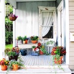
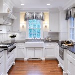
The application of warm color palettes varies depending on the room's function and desired mood. In a living room, a combination of burnt orange, gold, and beige can create a sophisticated and inviting atmosphere. A kitchen might benefit from the cheerful energy of tangerine and yellow, while a bedroom might utilize softer peaches and creams for a relaxing ambiance.
Accent colors, while not the dominant hues, play a vital role in a warm color scheme. Cool accent colors, such as deep blues or greens, can create a striking contrast and prevent the space from feeling overwhelming. These accents should be used sparingly to maintain the overall warm tone.
Furniture choices significantly influence the success of a warm color palette. Wooden furniture with warm undertones complements the color scheme, while metallic accents in gold or copper can add a touch of elegance. Upholstery in warm tones or with textured fabrics contributes to the overall cozy and inviting feel.
Decorative accessories further personalize and enhance the warm color scheme. Throw pillows, blankets, and rugs in warm tones or with complementary patterns add visual interest and texture. Artwork featuring warm colors or natural elements reinforces the overall theme.
When implementing a warm color palette, consider the existing architectural features of the room. Fireplaces, exposed brick, or wooden beams can enhance the warmth and character of the space. These features can be incorporated into the overall design to create a cohesive and harmonious look.
The size and orientation of the room also influence the choice of warm colors. In smaller rooms, lighter warm tones can create a sense of spaciousness, while darker shades might feel more intimate. Rooms with ample natural light can handle bolder warm colors, while rooms with limited light might benefit from lighter and brighter hues.
Successfully implementing a warm color palette involves careful planning and consideration of various elements, including color balance, texture, lighting, and room function. By understanding the principles of color theory and incorporating these elements effectively, one can create a space that is both visually appealing and emotionally comforting.

Warm Colour Palette

Pin On Color Palettes For Interior Design

Pin On Color Palette Inspiration

Cozy Warm Home Décor Inspiration The Inspired Abode

Color Palette For Home 12 Combos Designers Love Havenly Interior Design Blog

Pin Em Living Room Ideas

Color Palette For Home 12 Combos Designers Love Havenly Interior Design Blog

How To Choose A Color Palette You Will Love In Your Home Marcelle Guilbeau
:strip_icc()/101387342-fcb84f75aa7d44eb879b584d725b080d.jpg?strip=all "21 Warm And Cozy Color Palettes To Make Any Room Feel Inviting")
21 Warm And Cozy Color Palettes To Make Any Room Feel Inviting

Colour Palette By Paleutr Color Interior Design House Palettes Paint Colors For Home
Related Posts