Home Decor Color Ideas: A Comprehensive Guide
Color plays a fundamental role in shaping the ambiance and perceived function of a living space. The careful selection of colors for walls, furniture, and accessories can drastically alter the mood and overall aesthetic of a home, influencing factors such as perceived size, temperature, and even emotional well-being. This article will explore various color strategies and provide insight into how to effectively utilize color to create a harmonious and aesthetically pleasing environment.
Understanding the principles of color theory is essential for making informed decisions. Color theory encompasses the relationships between different hues, their impact on the human eye, and how they can be combined to achieve specific visual effects. Mastering these principles allows for the creation of balanced and visually engaging spaces that cater to individual preferences and lifestyle needs.
Key Point 1: Understanding Color Psychology and its Impact
Color psychology is the study of how colors affect human emotions and behavior. Different colors evoke different psychological responses, and understanding these associations can be a valuable tool in interior design.
For instance, blue is often associated with tranquility, serenity, and stability. It is a popular choice for bedrooms and bathrooms, promoting relaxation and a sense of calm. However, using too much of a dark blue can feel cold or depressing, so it's crucial to balance it with warmer accents or lighter shades.
Green is linked to nature, growth, and harmony. It can create a sense of renewal and freshness in a space, making it suitable for living rooms or home offices. Lighter shades of green can feel airy and refreshing, while darker shades can add sophistication and depth.
Yellow is associated with optimism, energy, and cheerfulness. It is often used in kitchens and dining areas to stimulate appetite and create a welcoming atmosphere. However, excessive use of yellow can be overwhelming, so it's best to use it as an accent color or in muted tones.
Red is a bold and stimulating color associated with passion, energy, and excitement. It can be effective in creating a focal point or adding drama to a space, but it should be used sparingly as it can be overwhelming or even agitating if overused. Consider using red accents in dining rooms or hallways to create a sense of energy and warmth.
Orange is a warm and inviting color that combines the energy of red with the cheerfulness of yellow. It is often used in living rooms and social spaces to create a sense of comfort and hospitality. It can also stimulate conversation and promote a positive mood.
Purple is associated with royalty, luxury, and creativity. It can add a touch of elegance and sophistication to a space, particularly in bedrooms or studies. Lighter shades of purple, such as lavender, can be calming and relaxing, while darker shades can create a sense of drama and mystery.
Neutral colors, such as white, gray, and beige, provide a versatile backdrop for other colors and design elements. They can create a sense of spaciousness and airiness and are often used in modern or minimalist interiors. Neutral colors also allow for greater flexibility in terms of furniture and accessory choices.
Key Point 2: Exploring Color Schemes and Harmonious Combinations
A color scheme is a planned combination of colors designed to create a specific visual effect. Several established color schemes are frequently employed in interior design, each offering a distinct aesthetic.
A monochromatic color scheme utilizes various shades, tints, and tones of a single color. This creates a cohesive and harmonious look that is both soothing and elegant. For example, a blue monochromatic scheme might involve using light blue walls, navy blue furniture, and aqua-colored accessories.
A complementary color scheme pairs colors that are opposite each other on the color wheel, such as blue and orange or red and green. This creates a vibrant and dynamic contrast that can add energy and visual interest to a space. When using complementary colors, it's important to balance them carefully to avoid overwhelming the eye. Often, one color will serve as the dominant shade, with the other used as an accent.
An analogous color scheme uses colors that are adjacent to each other on the color wheel, such as blue, blue-green, and green. This creates a harmonious and soothing look that is less dramatic than a complementary scheme. Analogous schemes are often used in bedrooms and living rooms to create a sense of calm and relaxation.
A triadic color scheme uses three colors that are equally spaced apart on the color wheel, such as red, yellow, and blue. This creates a vibrant and balanced look that is more complex than a complementary scheme. When using a triadic scheme, it's important to choose one dominant color and use the other two as accents.
A tetradic color scheme uses four colors that form two complementary pairs on the color wheel. This is the most complex color scheme and requires careful planning to avoid a cluttered or overwhelming look. It's best to use a tetradic scheme in larger spaces with plenty of natural light.
Beyond these established schemes, consider utilizing neutrals with pops of color. Using white as a base and then adding in other colors via curtains, pillows, and art can bring a room to life without overwhelming it. It is beneficial to create moodboards or use online color palette generators to visualize how different color combinations will appear in a space before committing to any purchasing decisions.
Key Point 3: Practical Application of Color in Different Rooms
Each room in a home serves a different purpose and, therefore, requires a tailored color approach. Considering the function and desired atmosphere of each space is crucial when selecting colors.
In bedrooms, calming and relaxing colors are often preferred. Soft blues, greens, and lavenders can create a serene atmosphere conducive to sleep. Neutral colors, such as gray and beige, are also popular choices for bedrooms, providing a versatile backdrop for other design elements. Avoid using overly stimulating colors, such as bright reds and oranges, which can disrupt sleep patterns.
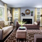
Living rooms are often the focal point of a home and should be inviting and comfortable. Warm and inviting colors, such as browns, beiges, and grays, can create a cozy atmosphere. Accent colors, such as blues, greens, and yellows, can add visual interest and personality to the space. Consider the amount of natural light in the room when selecting colors. Darker colors can make a small room feel even smaller, while lighter colors can brighten up a dark room.
Kitchens should be functional and inviting. Bright and cheerful colors, such as yellows, oranges, and reds, can stimulate appetite and create a welcoming atmosphere. However, it's important to balance these colors with neutrals to avoid overwhelming the space. Consider the color of your cabinets and appliances when selecting kitchen colors. White cabinets are a versatile choice that can be paired with a variety of colors, while darker cabinets may require lighter wall colors to prevent the room from feeling too dark.
Bathrooms should be clean and refreshing. Light and airy colors, such as whites, blues, and greens, can create a sense of spaciousness and hygiene. Consider the amount of natural light in the bathroom when selecting colors. Darker colors can make a small bathroom feel even smaller, while lighter colors can brighten up a dark bathroom. Accents of brighter colors can be added through towels and accessories.
Home offices should be conducive to focus and productivity. Calming and neutral colors, such as grays, blues, and greens, can promote concentration and reduce distractions. Avoid using overly stimulating colors, such as bright reds and oranges, which can be distracting and lead to fatigue. Consider the type of work being done in the office when selecting colors. If the work is creative, a more stimulating color scheme may be appropriate. If the work is analytical, a more calming color scheme may be preferred.
Hallways and entryways provide opportunities to introduce color and personality into a home. Bold and dramatic colors can create a striking first impression, while lighter colors can make a narrow hallway feel more spacious. Consider the overall style of the home when selecting colors for hallways and entryways. A modern home may benefit from bolder colors and geometric patterns, while a traditional home may be better suited to more muted colors and classic designs.
Ultimately, the choice of colors for a home is a personal one. By understanding the principles of color theory and color psychology, it is possible to create spaces that are both aesthetically pleasing and emotionally fulfilling. The key is to experiment with different colors and combinations to find what works best for individual preferences and lifestyle needs.

15 Designer Tricks For Picking A Perfect Color Palette

30 Living Room Color Ideas Best Paint Decor Colors For Rooms

50 Popular Living Room Colors Paint Ideas
:max_bytes(150000):strip_icc()/warm-and-cozy-paint-colors-down-pipe-2f1db86467ff44f9a353672387c8dfba.jpg?strip=all "15 Paint Colors That Will Make Your Home Feel Warm And Cozy")
15 Paint Colors That Will Make Your Home Feel Warm And Cozy

20 Top Interior Color Schemes For Your House Design Foyr Neo

59 Living Room Color Combinations Best Scheme

100 Best Color Ideas For Every Rooms Decorating With Paint

5 Tips To Help You Choose The Right Colour Scheme Home Decorating Ideas

5 Neutral Living Room Paint Color Ideas Design Cafe

11 Best Chartreuse Color Ideas Home Decorating With
Related Posts