Home Colour Decoration: A Comprehensive Guide
Colour plays a pivotal role in shaping the atmosphere and aesthetic appeal of any home. More than just an aesthetic choice, strategically implementing colour in home decoration can influence mood, perception of space, and overall well-being. Understanding the fundamentals of colour theory and how it relates to interior design is crucial for creating harmonious and visually pleasing living spaces.
The impact of colour extends beyond mere visual preference. Different colours have distinct psychological effects. For example, blues and greens are often associated with calmness and serenity, making them suitable for bedrooms and relaxation areas. Reds and oranges, on the other hand, can evoke feelings of energy and excitement, rendering them appropriate for dining rooms or spaces where social interaction is encouraged. The strategic use of colour can effectively tailor the ambiance of a room to its intended purpose.
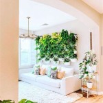
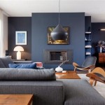
Furthermore, colour can significantly impact the perception of space. Lighter colours tend to create an illusion of spaciousness, making them ideal for smaller rooms. Conversely, darker colours can make a room feel cozier and more intimate, which might be suitable for larger, more open areas. Employing different colour schemes can effectively manipulate the perceived size and shape of a room to achieve a desired effect.
Understanding Colour Theory
Colour theory provides the groundwork for informed colour selection in home decoration. Central to this theory is the concept of the colour wheel, which visually represents the relationships between different colours. The wheel is composed of primary, secondary, and tertiary colours, each contributing to the overall harmony or contrast within a colour scheme. A solid grasp of the colour wheel facilitates the creation of balanced and aesthetically pleasing interiors.
Primary colours – red, yellow, and blue – are the foundation of all other colours. These cannot be created by mixing other colours together. Secondary colours – green, orange, and purple – are created by mixing two primary colours. Tertiary colours are created by mixing a primary and a secondary colour, such as red-orange or blue-green. This foundational understanding is crucial for developing a cohesive palette.
Colour schemes are built upon the relationships between colours on the colour wheel. Some common colour schemes include:
Monochromatic: This scheme uses variations of a single colour, creating a subtle and unified look. Different shades, tints, and tones of the chosen colour are used to add depth and interest. For example, a monochromatic blue scheme might include light sky blue walls, navy blue furniture, and teal accents.
Analogous: This scheme uses colours that are adjacent to each other on the colour wheel, creating a harmonious and peaceful effect. For instance, a combination of blue, blue-green, and green can produce a calming and nature-inspired ambiance.
Complementary: This scheme uses colours that are opposite each other on the colour wheel, creating a high-contrast and vibrant look. For example, red and green or blue and orange offer strong visual impact. When using complementary colours, it is important to balance the intensity of each colour to prevent overwhelming the space.
Triadic: This scheme uses three colours that are equally spaced on the colour wheel, offering a balanced and vibrant feel. Examples include red, yellow, and blue, or green, orange, and purple. Triadic schemes should be carefully balanced to ensure visual harmony.
Beyond these basic schemes, more complex arrangements can be achieved by combining elements from different schemes or introducing neutral tones. A neutral palette accented with pops of colour from a complementary scheme, for example, can offer a sophisticated and balanced look.
Factors Influencing Colour Choice
Selecting the right colours for home decoration involves considering various factors that extend beyond personal preference. The architecture of the house, the amount of natural light available, the function of each room, and the existing furniture all play a role in determining the most suitable colour palette. Ignoring these factors can result in a colour scheme that clashes with the overall design or fails to achieve the desired ambiance.
The architectural style of the house can significantly impact colour choices. Traditional homes often benefit from classic and timeless colour schemes, while modern homes may accommodate bolder and more contemporary palettes. Consider the existing features of the house, such as the flooring, trim, and architectural details, when selecting colours to ensure a cohesive and integrated look.
The amount of natural light available in a room is another crucial consideration. Rooms with ample natural light can handle bolder and darker colours without feeling oppressive. Conversely, rooms with limited natural light benefit from lighter and brighter colours to maximize the perceived brightness and spaciousness. The orientation of the room (north, south, east, or west) also affects how light interacts with colour, impacting the overall appearance.
The function of each room should also influence colour choices. Bedrooms, for example, often benefit from calming and relaxing colours like blues, greens, or neutrals, whereas dining rooms may benefit from warmer and more energetic colours like reds, oranges, or yellows. High-traffic areas like hallways and entryways may require more durable and stain-resistant colours, while living rooms can be more versatile and adaptable to different colour schemes.
Finally, the existing furniture and accessories should be taken into account when selecting colours. Consider the colour and style of the furniture, artwork, and other decorative items to ensure they complement the chosen colour scheme. Incorporating accent colours that tie together different elements in the room can create a more cohesive and visually appealing space.
Practical Application of Colour in Home Decoration
Translating colour theory into practical application involves careful planning and execution. This includes selecting paint colours, choosing furniture and accessories, and considering the overall balance and harmony of the space. A systematic approach to colour selection can help achieve a cohesive and aesthetically pleasing result.
When selecting paint colours, it is advisable to test samples in the actual room before committing to a particular shade. Paint colours can appear differently under different lighting conditions, so it is important to observe how the colour looks at different times of day. Painting large swatches of the test colours on the walls can provide a more accurate representation of the final result.
Choosing furniture and accessories that complement the chosen colour scheme is crucial for creating a cohesive look. Consider the colour, texture, and style of the furniture when making selections. Upholstery fabrics, rugs, curtains, and other decorative items should harmonize with the overall colour palette. Layering different textures and patterns within the same colour family can add depth and interest to the space.
Balancing warm and cool colours is another important consideration. Warm colours (reds, oranges, yellows) tend to advance and create a sense of energy and excitement, while cool colours (blues, greens, purples) tend to recede and create a sense of calm and relaxation. Balancing these colours can create a dynamic and visually appealing space. For example, a room with predominantly cool colours can be warmed up with accents of warm colours, such as throw pillows, artwork, or accessories.
Incorporating neutral tones can provide a grounding effect and allow other colours to stand out. Neutral colours like whites, grays, beiges, and browns can serve as a backdrop for bolder and more vibrant colours, creating a balanced and harmonious look. Using different shades and textures of neutral colours can add depth and interest to the space without overwhelming the other colours.
Finally, consider the use of accent colours to add pops of personality and visual interest. Accent colours can be used to highlight architectural features, create focal points, or add a touch of whimsy to the space. Using accent colours sparingly can prevent them from overwhelming the other colours and create a more balanced and cohesive look.
By carefully considering these factors and applying the principles of colour theory, it is possible to create a home that is both aesthetically pleasing and functional, reflecting personal style and enhancing the overall living experience. The strategic implementation of colour translates into a space that resonates with comfort, elegance, and a distinct sense of individuality.

50 Popular Living Room Colors Paint Ideas

5 Tips To Help You Choose The Right Colour Scheme Home Decorating Ideas

18 Best Home Interior Colour Combination Design Ideas

Home Colour Selection Wall Ideas For Your House 2025

Home Colour And Design Decoration Wall Painting Advertising Service

20 Latest Hall Colour Designs With Pictures In 2025

9 Ways To Select The Perfect Home Colours For Your House

Best Colour Combination For N Homes You Ll Adore Berger Paints

Best Colour Combination For Bedroom Modern Luxury Wall Home Pai Color Combinations

Colour Combo For Walls 19 Top Notch Ideas Stylish Makeovers Building And Interiors
Related Posts