What Are The Newest Colors For Home Decorating?
The world of interior design is a constantly evolving landscape, and colors play a pivotal role in reflecting current trends and shaping the ambiance of living spaces. Staying abreast of the newest color palettes for home decorating is crucial for homeowners, designers, and anyone seeking to refresh their environment with a modern and stylish touch. Predicting the dominant colors for a given year or season involves analyzing influences from various sources, including fashion, art, technology, and societal shifts. Understanding these forces provides insight into the evolving preferences for color in the home.
Several factors contribute to the emergence of new color trends. Pantone, a global authority on color, annually announces its "Color of the Year," based on extensive research and analysis of global trends. This selection often sets the tone for the upcoming year, influencing designers and consumers alike. Furthermore, paint manufacturers like Sherwin-Williams, Benjamin Moore, and Behr also release their own color forecasts, reflecting their interpretations of consumer desires and design directions. These forecasts are usually based on extensive research and consultations with industry experts.
Beyond these formal pronouncements, broader cultural and societal influences heavily impact color preferences. Economic stability, environmental concerns, and technological advancements can all shape consumer choices regarding color. For example, periods of economic uncertainty might lead to a preference for comforting and familiar colors, while increased awareness of environmental issues could drive the adoption of earthy and natural tones.
In essence, the newest colors for home decorating are not simply arbitrary choices; they are reflections of a complex interplay of influences that shape our aesthetic preferences and create visually appealing and emotionally resonant living spaces. Therefore, understanding these key elements is essential for informed decision-making when it comes to selecting the right colors for any interior design project.
Embracing Earthy Neutrals and Natural Tones
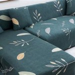
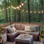
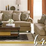
One of the most prominent trends in recent home decorating is the shift towards earthy neutrals and natural tones. This movement reflects a growing desire for connection with nature and a preference for calming and grounding environments. These colors offer versatility, adaptability, and a sense of timelessness that appeals to a wide range of homeowners. Earthy neutrals encompass a spectrum of hues inspired by the natural world, ranging from warm beiges and creams to soft grays and muted greens. These colors create a sense of serenity and can be easily layered with other textures and materials to create depth and interest. They work well in both modern and traditional settings and provide a neutral backdrop for bolder accent colors.
Warm beiges and creams, for instance, offer a comforting and inviting atmosphere. These hues evoke feelings of warmth and security, making them ideal for bedrooms, living rooms, and other spaces intended for relaxation. They pair well with natural materials like wood, stone, and linen, further enhancing the connection with nature. These colors are also highly versatile and can be used in a variety of design styles, from minimalist to bohemian.
Soft grays, on the other hand, provide a more sophisticated and contemporary feel. These hues offer a cooler and more understated alternative to beige and cream, and they can be used to create a sense of calm and tranquility. Soft grays pair well with metallic accents, such as gold or silver, to add a touch of elegance and glamour. They also work well with brighter pops of color, allowing for a more dynamic and personalized look.
Muted greens, inspired by foliage and landscapes, bring a touch of nature indoors. These colors are particularly well-suited for creating a calming and restorative environment. They can be used in bedrooms, bathrooms, and even kitchens to promote a sense of well-being. Muted greens pair well with natural wood tones, creating a harmonious and organic aesthetic. They also work well with other earthy neutrals, such as beige and brown, to create a cohesive and balanced color scheme.
The incorporation of natural materials, such as wood, stone, and linen, alongside these earthy neutrals further enhances the overall aesthetic. These materials add texture, depth, and a sense of organic beauty to the space. This combination of natural colors and materials creates a sanctuary-like environment that promotes relaxation and well-being, reflecting a growing desire for biophilic design – incorporating elements of nature into the built environment.
Bold and Optimistic Hues for a Touch of Personality
While earthy neutrals provide a foundation for many modern interiors, bold and optimistic hues are emerging as essential for adding personality and vibrancy to living spaces. These colors reflect a growing desire for self-expression and a move away from purely minimalist aesthetics. Bold hues inject energy and excitement into a room, creating a focal point and reflecting the homeowner's individual style. These colors can be used strategically as accent colors, statement walls, or even in furniture and accessories.
Deep blues, such as navy and indigo, offer a sense of sophistication and depth. These colors create a calming yet impactful presence, working well in living rooms, bedrooms, and even home offices. Deep blues pair well with metallic accents, such as gold or brass, to add a touch of luxury and glamour. They also complement natural textures like wood and leather, creating a balanced and inviting space.
Terracotta and rust tones provide warmth and earthiness while still offering a bolder alternative to traditional neutrals. These colors evoke feelings of warmth, comfort, and connection to the earth. They work well in kitchens, dining rooms, and living rooms, creating a welcoming and inviting atmosphere. Terracotta and rust tones pair well with natural materials like wood and stone, as well as with pops of color like teal or mustard yellow.
Mustard yellow and ochre offer a vibrant and energetic pop of color. These colors bring a sense of optimism and cheerfulness to any space, working well as accent colors in pillows, throws, and artwork. Mustard yellow and ochre pair well with neutral backgrounds like gray or white, adding a touch of warmth and personality without overwhelming the space. They also complement natural wood tones and bring a sense of vibrancy to a room.
Emerald green and teal offer a touch of sophistication and elegance. These colors evoke feelings of nature and tranquility, working well in living rooms, bedrooms, and even bathrooms. Emerald green and teal pair well with metallic accents like gold or silver, adding a touch of luxury and glamour. They also complement natural textures like velvet and silk, creating a luxurious and inviting space.
When incorporating bold colors, it is important to consider the overall balance and harmony of the space. Using a color wheel can be helpful in selecting complementary colors that work well together. It is also important to consider the lighting in the room, as different colors will appear differently under different lighting conditions. Ultimately, the goal is to create a space that reflects the homeowner's personal style and creates a welcoming and inspiring environment.
Pastels with a Modern Twist
While traditionally associated with nurseries and feminine spaces, pastels are experiencing a resurgence in modern home decorating, but with a contemporary twist. Instead of overly sweet and saccharine hues, modern pastels are often muted, sophisticated, and paired with unexpected elements for a more mature and stylish aesthetic. This new iteration of pastels allows for a softer and more approachable way to incorporate color into the home while maintaining a sense of elegance and sophistication. The key is to avoid overly bright and childish tones, opting instead for muted and nuanced shades that feel both calming and contemporary.
Powder blue, for example, offers a calming and serene atmosphere. This hue evokes feelings of tranquility and peace, making it ideal for bedrooms, bathrooms, and even home offices. Powder blue pairs well with neutral accents like white, gray, and beige, creating a soft and airy aesthetic. It also complements natural materials like linen and cotton, enhancing the sense of calm and relaxation.
Blush pink provides a touch of warmth and femininity without being overly saccharine. This color evokes feelings of comfort and happiness, making it a versatile option for living rooms, bedrooms, and even kitchens. Blush pink pairs well with metallic accents like gold or rose gold, adding a touch of glamour and sophistication. It also complements natural textures like velvet and silk, creating a luxurious and inviting space.
Mint green offers a refreshing and invigorating touch of nature. This color evokes feelings of freshness and vitality, making it ideal for bathrooms, kitchens, and even entryways. Mint green pairs well with neutral accents like white and gray, creating a clean and modern aesthetic. It also complements natural materials like wood and stone, enhancing the sense of connection to nature.
Lilac provides a touch of elegance and sophistication without being overly formal. This color evokes feelings of creativity and inspiration, making it a unique option for living rooms, bedrooms, and even home offices. Lilac pairs well with metallic accents like silver and chrome, adding a touch of glamour and sophistication. It also complements natural textures like wool and cashmere, creating a cozy and inviting space.
The key to using pastels successfully is to balance their softness with stronger elements. Pairing them with darker colors like charcoal gray or navy blue can create a striking contrast and add depth to the space. Incorporating metallic accents, such as gold or silver, can also elevate the look and add a touch of glamour. Furthermore, using textures and patterns can prevent the pastel palette from feeling flat and one-dimensional. Mixing different textures, such as velvet, linen, and wool, can add visual interest and create a more dynamic and engaging space. By using these strategies, pastels can be transformed from a traditionally childish palette into a sophisticated and contemporary choice for modern home decorating.

Top 5 Home Decor Color Trends 2025 Blog

Color Trends What S New Next

25 Home Decor Color Match Palettes Living Room Combination Modern Colors

Top 5 Home Decor Color Trends 2025 Blog

The Most Popular Living Room Colours For 2025

Home Decor Color Trends 2025 Decoholic

Home Decor Colors For 2025 Which 4 Color Concepts Are Gonna Stand Out Daily Dream

Home Decor Color Trends Everyone Will Be Talking About In 2025

The Most Popular Living Room Colours For 2025

Home Decor Trends That Will Be Popular In 2025 According To Designers
Related Posts