2017 Home Decor Color Trends: A Palette of Comfort and Energy
The year 2017 witnessed a significant shift in home decor color trends, moving away from stark minimalism towards warmer, more inviting and personality-driven spaces. The prevailing trends reflected a desire for comfort, connection to nature, and a touch of playful energy. The color palettes embraced both subtle, grounding tones and bolder, statement hues, allowing for diverse individual expression within a framework of overall harmony. Understanding these trends provides a valuable lens through which to appreciate the stylistic evolution of interior design and to glean inspiration for creating timeless and appealing living environments.
Several key factors influenced the color landscape of 2017. The growing awareness of wellness and its connection to the home environment helped prioritize calming and restorative colors. Simultaneously, a desire for personal expression and a rejection of generic design pushed bolder, more adventurous choices to the forefront. The rise of social media and online design resources amplified the dissemination of these trends, creating a more rapid and widespread adoption of popular color schemes. Furthermore, the increasing accessibility of high-quality paints and materials empowered homeowners to experiment with color palettes and achieve professional-looking results.
Green: A Resurgence of Nature's Hue
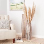
Green, in its various shades and intensities, emerged as a dominant force in 2017 home decor. This trend reflected a growing appreciation for nature and a desire to bring the outdoors in. From deep, forest greens to softer, sage varieties, the versatility of green allowed it to be used in a variety of contexts. It was often paired with natural materials such as wood, stone, and linen to further enhance the sense of organic connection. Green also worked well as an accent color against neutral backdrops, providing a refreshing pop of vibrancy.
Specifically, "Greenery," Pantone's 2017 Color of the Year, played a significant role in shaping the trend. This vibrant, zesty yellow-green was intended to symbolize new beginnings and the revitalizing power of nature. While not universally embraced as a primary wall color, Greenery found success as an accent in accessories, textiles, and artwork. Its presence served as a reminder to incorporate elements of nature into the home and to embrace a more optimistic outlook.
Beyond Greenery, other shades of green gained popularity. Olive green, with its earthy undertones, provided a more subdued and sophisticated option. Emerald green, reminiscent of precious gemstones, offered a touch of luxury and drama. Seafoam green, with its calming, watery quality, created a serene and relaxing atmosphere. The diverse range of green hues allowed homeowners to tailor their color choices to suit their individual preferences and the specific character of their homes.
The integration of green wasn't limited to paint colors. Indoor plants experienced a surge in popularity, becoming essential elements of home decor. The use of living walls, vertical gardens, and potted plants added vibrancy, texture, and a sense of well-being to interior spaces. This trend further solidified the connection between green color palettes and the overall desire to create a more natural and harmonious living environment.
Neutral Warmth: Embracing Comfort and Sophistication
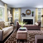
While bolder colors made inroads, neutral color palettes remained a cornerstone of interior design in 2017. However, the emphasis shifted from cool grays and stark whites to warmer, more inviting neutrals. These included creamy whites, soft beiges, warm grays (often referred to as "greige"), and earthy browns. The goal was to create spaces that felt comfortable, sophisticated, and conducive to relaxation. These warmer neutrals provided a versatile backdrop for layering textures, adding pops of color, and showcasing personal style.
The shift towards warmer neutrals reflected a desire for more inviting and approachable spaces. Cool grays, while still prevalent in some applications, began to lose ground to warmer alternatives that provided a more comforting and less clinical feel. The warmth in these neutral palettes often came from subtle undertones of yellow, orange, or brown, which added depth and complexity to the overall effect.
These warmer neutrals also proved to be highly versatile, working well in a variety of architectural styles and room types. They provided a blank canvas for showcasing furniture, artwork, and accessories, allowing homeowners to personalize their spaces without overwhelming the overall aesthetic. They also paired well with natural materials such as wood, stone, and leather, further enhancing the sense of warmth and comfort.
The use of texture played a crucial role in enhancing the appeal of neutral palettes. Layering different textures, such as soft fabrics, woven rugs, and textured wall coverings, added depth and visual interest to otherwise monochromatic spaces. This approach prevented neutral rooms from feeling flat or boring and allowed homeowners to create spaces that were both sophisticated and inviting.
Jewel Tones: Adding Depth and Drama
In contrast to the calming nature of greens and warm neutrals, jewel tones offered a bolder and more dramatic approach to home decor in 2017. These rich, saturated colors, inspired by precious gemstones, added depth, luxury, and a touch of opulence to interior spaces. Popular jewel tones included emerald green, sapphire blue, ruby red, amethyst purple, and topaz yellow. These colors were often used as accents in furniture, textiles, and artwork, providing a striking contrast against neutral backdrops.
The appeal of jewel tones stemmed from their ability to evoke a sense of luxury and sophistication. These colors were often associated with royalty and grandeur, and their use in home decor added a touch of elegance and refinement. Jewel tones also possessed a depth and complexity that made them visually engaging and emotionally resonant.
While jewel tones could be used as primary wall colors, they were more commonly employed as accents. A velvet sofa in sapphire blue, a set of ruby red throw pillows, or an amethyst purple rug could add a pop of color and drama to a neutral room without overwhelming the overall aesthetic. Jewel tones also worked well in smaller spaces, such as powder rooms or entryways, where their impact could be maximized.
The pairing of jewel tones with metallic accents, such as gold, silver, or brass, further enhanced their sense of luxury and opulence. These metallic elements added a touch of shine and glamour, complementing the rich colors and creating a sophisticated and visually striking effect. The combination of jewel tones and metallics was particularly effective in creating glamorous and inviting living spaces.
Earthy Tones: Grounding and Connecting
Beyond green, the broader category of earthy tones also played a significant role in 2017 home decor trends. This encompassed a range of colors inspired by the natural world, including terracotta, rust, ochre, and various shades of brown. These colors evoked a sense of grounding, warmth, and connection to the earth, creating spaces that felt both comfortable and authentic.
The rise of earthy tones aligned with the broader trend of bringing the outdoors in. These colors were often paired with natural materials such as wood, stone, and clay, further enhancing the sense of organic connection. They also complemented the increasingly popular bohemian and global-inspired design styles, which emphasized natural textures and handcrafted elements.
Terra cotta, with its warm, reddish-brown hue, added a rustic and inviting touch to interior spaces. It worked well as a wall color, particularly in kitchens and dining rooms, creating a sense of warmth and conviviality. Rust, a deeper and more saturated shade of red-brown, provided a bolder and more dramatic option, often used as an accent color in furniture or textiles.
Ochre, a yellow-brown pigment derived from clay, added a touch of warmth and sophistication to neutral palettes. It worked well as a wall color or as an accent color in accessories and artwork. Various shades of brown, from light beige to dark espresso, provided a range of options for creating comfortable and grounding spaces. These colors were often used in furniture, flooring, and wood trim, adding a sense of warmth and stability to interior designs.
The emphasis on earthy tones reflected a growing desire for authenticity and a rejection of artificiality in home decor. These colors evoked a sense of timelessness and natural beauty, creating spaces that felt both comfortable and connected to the earth. Their versatility allowed homeowners to incorporate them into a variety of design styles, from traditional to contemporary, creating spaces that were both stylish and personally meaningful.

20 Interior Design Trends 2025 Must Have Looks You Ll Love Decorilla

2025 Color Collection Of The Year Home By Sherwin Williams

20 Interior Design Trends 2025 Must Have Looks You Ll Love Decorilla

20 Interior Design Trends 2025 Must Have Looks You Ll Love Decorilla

2025 Color Collection Of The Year Home By Sherwin Williams

Living Room Trends 2025 What S New In Home Comfort And Style Decorilla Interior Design

20 Interior Design Trends 2025 Must Have Looks You Ll Love Decorilla

Check Out These 20 Interior Design Trends For 2025 Inspirations Essential Home

2025 Color Collection Of The Year Home By Sherwin Williams

Check Out These 20 Interior Design Trends For 2025 Inspirations Essential Home
Related Posts